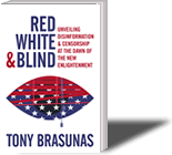
Vote on the Book Cover!
16 2022
This book is nearly complete. Years of research and writing have culminated in Red, White & Blind, a deep and thorough investigation into censorship and misinformation in America, and what to do about it. My hope is that it prompts some great conversations and helps at least a few Americans see the world a little more truthfully.
Like every book, this one now needs a cover.
I’m working with a professional cover designer, and we have several that I believe have great potential. Can you help me by voting below for the one(s) that you find most compelling?
Note: All the covers are works in progress and will improve once we choose the best to focus on. The subtitle is also a work in progress and will likely change.
Size Matters
 The ideal cover will look great both on a bookstore shelf and as a small thumbnail image in an Amazon listing. If you were in a bookstore, which cover would draw you in? In your opinion, should the cover evoke the many topics explored — such as social media censorship and a “balanced media diet” — or do you prefer simplicity? Essentially, I want to present a great image to attract the people who would enjoy and benefit from the investigation — as well as to draw in those who might, you know, judge a book by its…
The covers appear in random order. Check the box for the cover(s) you think would be best. Then click the ‘Vote’ button.
The poll is now closed.
Thank you!
Please also leave a comment below to share why you voted the way you did.
If you don’t think any of the covers are good enough and we should go back to the drawing board, tell me that.
I’ve spent over two years researching and writing this book. It’s been a labor of love, it’s nearly done, and now it’s time to clothe it so it finds its audience.
Thank you so much for your help!


Thanks everyone for voting and for the great comments! Still a few more days to vote for anyone who hasn’t yet. I’ll be posting the results soon.
My favorites are 6 + 9 (I think those were the numbers…)
One was the white background with big title words crossed out.
It somehow straddled a few that are not easy to capture in one image:
1) grabbed me viscerally + made me want to look inside
2) it felt “professional” and “journalistic,” perhaps the font for the subtitle contributed to this … in any case, I liked it!
One was one of the “eye” variation covers. The eye in this image makes me think of secret societies that control masses, and of course the eyes and blindness connection. As for why I chose that particular one, the harmony of the elements appealed to me.
I voted already but I don’t think it registered. So just now I picked 3 and 7. These are the most clear, elegant and hitting. Easiest to get the title. The covers with the words painted out doesn’t appeal at all. I agree with the person who voted that didn’t relate to the white man and wondered if you could do some with a female and some with a male? Also I see you vary the sentence from “deceives you to won’t tell you.” Are you asking us to vote on that too?
I love the blinds coming down over the eye but did not vote for that concept because in thumbnail size it looks like blood I’m and dripping out of the eye…. An east fix would be to change up the colors so the blinds aren’t red. Also in thumbnail size, it’s hard to see what is going on with the hand coming out of the computer – looks like scissors to me!
As Is, I prefer the simplest – titles with cross outs – that are effective when small,and large.
Good job generating several creative options!
I think the white covers looked the most attractive, with the Eye/Blinds logo one being the best, especially as it gives you a logo you can use everywhere in thumbnails (and it has the “blinds” that go along well with it). There were a few variations on that layout, I think 6 is the best looking of the 3 variants.
All great options. I like the stars over the white man, but because it was a white man, it was too specific – didn’t speak to me as a woman, and definitely appeared to be speaking to a privileged audience, so didn’t get my vote. Also, no offense, but I’m not sure your name is a selling point yet, so think it should be smaller than font for the title.
I voted for the red cover one (can’t see the number now) because it popped out as eye-catching and professional looking.
I voted for 9 & 10, not 8 & 10. still want to see it in blue
I voted for the 2 I think are best……but I’m not sure about the color scheme. It’s easier to read the title on the mainly white background, but I think the mainly red background is better. I’d like to see it tried with a mainly blue background….
6 gets my vote. I don’t like the ones that are effectively crossing out the title. I notice and appreciate the use of the second sense of the word “blind” (something that hangs in front of your window), but probably people who didn’t study the cover won’t.
I voted for #6 and #8. I think those are bold and beautiful. Great work on this, excited to see the book when it’s out!